Monday, October 10, 2022

React: UseEffect Types and working flow


useEffect(()=>{
  console.log("Effect Running");
});

Runs Every Time:


useEffect(()=>{
  console.log("Effect Running");
},[])

Runs Only Once:


3.

const Login = (props) => {
  const [enteredEmail, setEnteredEmail] = useState('');
  const [emailIsValid, setEmailIsValid] = useState();
  const [enteredPassword, setEnteredPassword] = useState('');
  const [passwordIsValid, setPasswordIsValid] = useState();
  const [formIsValid, setFormIsValid] = useState(false);

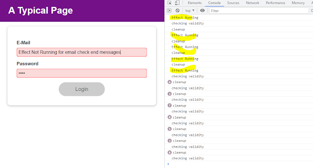
useEffect(()=>{
  console.log("Effect Running");
},[enteredPassword])


Effect Running for password:


const Login = (props) => {
  const [enteredEmail, setEnteredEmail] = useState('');
  const [emailIsValid, setEmailIsValid] = useState();
  const [enteredPassword, setEnteredPassword] = useState('');
  const [passwordIsValid, setPasswordIsValid] = useState();
  const [formIsValid, setFormIsValid] = useState(false);

useEffect(()=>{
  console.log("Pass Effect Running");
  return ()=>{ console.log("Pass Effect Cleanup")}
},[enteredPassword]);

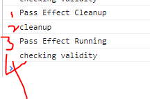
Password Effect cleanup runs first (ie, return statement runs first)(first console msg loads onload webpage ie, pass effectr runnig and checkig validity)
order:


Saturday, October 8, 2022

React: Error Modal popup | Created div's in Index.html

 
 Modal popups is hidden by default,(coded inside nested div's ) so instead of using it in root div, 
created new divs, in index.html in public folder


Step 1 :In react project: in index.html added below lines

 <div id="backdrop-root"></div>

    <div id="modal-root"></div>

    <div id="root"></div>

ErrorModal code: 
pushing to above new created div's

import React from "react";
import ReactDOM from "react-dom";
import Card from "./Card";
import Button from "./Button";
import classes from "./ErrorModal.module.css";

const Backdrop = (props) => {
  return <div className={classes.backdrop} onClick={props.onConfirm} />;
};
const ModalOverlay = (props) => {
  return (
    <Card className={classes.modal}>
      <header className={classes.header}>
        <h2>{props.title}</h2>
      </header>
      <div className={classes.content}>
        <p>{props.message}</p>
      </div>
      <footer className={classes.actions}>
        <Button onClick={props.onConfirm}>Okay</Button>
      </footer>
    </Card>
  );
};

const ErrorModal = (props) => {
  return (
    <React.Fragment>
      /* imprt reactdom , it exists in package.json*/
      {ReactDOM.createPortal(
        <Backdrop onConfirm={props.onConfirm} />,
        document.getElementById("backdrop-root")
      )}
      {/* above   <Backdrop onConfirm={props.on is for closing popup oon clicking other than popup */}
      {ReactDOM.createPortal(
        <ModalOverlay
          title={props.title}
          message={props.message}
          onConfirm={props.onConfirm}
        />,
        document.getElementById("modal-root")
      )}
    </React.Fragment>
  );
};

export default ErrorModal;


Old code ErrorModal.js

import React from 'react';

import Card from '../Card';
import Button from '../Button';
import classes from './ErrorModal.module.css';

const ErrorModal = (props) => {
  return (
    <div>
      <div className={classes.backdrop} onClick={props.onConfirm} />
      <Card className={classes.modal}>
        <header className={classes.header}>
          <h2>{props.title}</h2>
        </header>
        <div className={classes.content}>
          <p>{props.message}</p>
        </div>
        <footer className={classes.actions}>
          <Button onClick={props.onConfirm}>Okay</Button>
        </footer>
      </Card>
    </div>
  );
};

export default ErrorModal;

Use Wrapper to avoid empty div's for grouping

After using wrapper instead of div, grouping ignored wrapper tag. 


created wrapper for ignoring grouping div, (for performance increase)

wrapper in app.js<Wrapper>...</Wrapper>


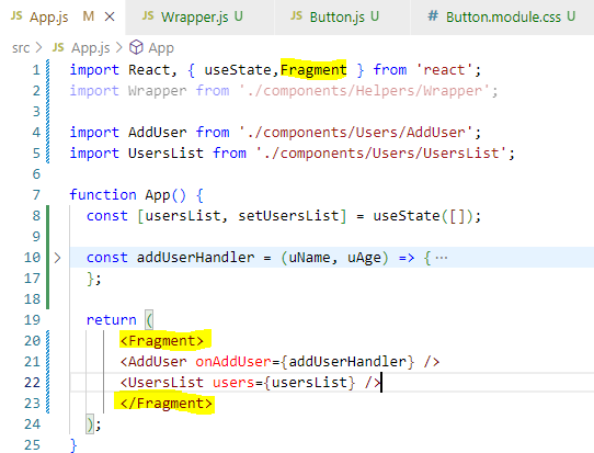
2. type : use empty wrapper <>....</>


3.type if empty tags wrapper wont work use below 
<React.Fragment> ....</React.Fragment>

Type 4:  import Fragment in react: then add tag <Fragment></Fragment>

Note
With Type 2,3,4  no need of using type 1 wrapper creation, 
Type 2,3,4 are inbuild, 
Type 1 is manually created for understanding, how wrapper works.

React sending data to parent from sibling node

1.parent component
2.passing to sibling black and parent node red
3.sibling comonetn


React: Sending data to siblings

 1.React form component

2.calling above compoent


note: passing data to sibling.

---------------------------------

 NewExpense.js file:  

<ExpenseForm onSaveExpenseData={onSaveExpenseDataHandler}></ExpenseForm>

---------------------------------

ExpenseForm.js: 

 props.onSaveExpenseData(expenseData); // calling one js file to other(newexpense.js)

 setEnteredTitle("");

 setEnteredAmount("");

 setEnteredDate("");  

};

---------------------------------

calling expenseform in app.js

 for appending form data to app.js file arr.

pushing data to parent node

props.onAddExpense(expenseData)  // lifting up date to parent app.js


Use Card styling for specific tag.

 Card.js

import React from "react";
import  classes from './Card.module.css';
const Card=(props)=>{
    return <div className={classes.card}>{props.children}</div>
   //For Dynamic below code cssClassName as ClassName default // return <div className={`${classes.card} ${props.cssClassName}`}>{props.children}</div>
}

export default Card Card.module.css
.card{
    background-color: yellow;
}

App.js
import Form from './Components/Form';
import './App.css';
import { useState } from 'react';
import UserList from './Components/UserList';
import Card from './Components/UI/Card';

function App() {
const data=[{"name":1,"age":2},{"name":11,"age":21}];

const [users,setusers]=useState([]);
const userlist=(res)=>{
setusers(prevuser=>{
  return [res,...prevuser];
})
}
  return (<Card > // <Card cssClass={classes.input}>
    <div className="App">
      <Form userdata={userlist}></Form>
      <UserList items={users}></UserList>
    </div></Card>
  );
}

export default App;


Thursday, October 6, 2022

React : Inline styles

 import React, { useState } from 'react';

import Button from '../../UI/Button/Button';
import './CourseInput.css';
const CourseInput = props => {
  const [isvalid,setIsvalid]=useState(true);
  const [enteredValue, setEnteredValue] = useState('');
  const goalInputChangeHandler = event => {
    setEnteredValue(event.target.value);
  };
  const formSubmitHandler = event => {
    event.preventDefault();
    if(enteredValue.trim().length===0){
      setIsvalid(false)
      return;
    }else{  setIsvalid(true);}
    props.onAddGoal(enteredValue);
  };
  return (
    <form onSubmit={formSubmitHandler}>
      <div className="form-control">
        <label style={{color:!isvalid?"red":"black"}}>Course Goal</label>
        <input  style={{borderColor:!isvalid?"red":"black",background:!isvalid?"salmon":"transparent",}} type="text"
onChange={goalInputChangeHandler} />
      </div>
      <Button type="submit">Add Goal</Button>
    </form>
  );
};

export default CourseInput;